
If you haven’t kept up with this project, here’s a quick summary: I did the first 12 paintings all on the same big sheet of paper. Those were all fairly realistic still lifes. For the second sheet of paper, I’m doing more free/abstract reworkings of all the paintings from the first sheet. The idea is that since the first sheet gave me practice in rendering objects accurately from life, the second sheet will be practice in painting freely, without so much care for the way things really look.
After the intense physical torment of the previous painting, I was very glad I’d already decided on a simple, quick reworking of the Brussels sprouts. At first I’d intended to draw them all on top of each other — like a stack of translucent coasters — but when I tried that, it didn’t look good. I think the shapes aren’t really interesting enough for that. Moreover, after outlining all five sprouts at once and nearly on top of each other, I realized I’d never be able to tell all those pencil lines apart while painting. So I shifted gears and penciled and painted the first sprout, and then the second after the first had dried, and so on.
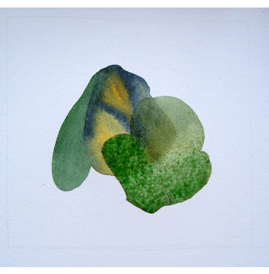
Unfortunately the green colors came out a bit murky, not the clear, light shades I wanted (I was hoping for something more akin to the transparency of The Crabapples of Time). I didn’t plan it this way, but the second phase of this project is quickly turning into a study of colors and values: how to mix and how not to mix, how much water to use and when, and how to layer colors without losing the brilliance of the first application. Somehow this wasn’t as much of an issue when I was drawing from life, but now that I’m interpreting more freely, it is essential… and I am finding that there is much room for improvement!!

Overall, though, I rather like the weirdness of the shape of my reworked sprouts. In fact, I am coming to very much like the weirdness of this entire sheet of paper. It’s obvious that it’s a revision of the first sheet, and yet it’s so different, and that fascinates me.
Side-by-side with the original:

And with the other paintings:


i really like this one actually! i love those translucent-y layers. as if you peeled the sprouts leaf by leaf and layered them on top of each other. i just love that translucent, water-y feel of the colors. i’m a big fan of olive green in general, so the original painting was nice color-wise, but overall i think this new one is a treat. i’m enjoying staring at it as a whole.
Oh thank you! Yes that’s a bit of the feel I was going for. 🙂 Not that Brussels leaves are that translucent, actually, but hey. 😉
love the colors!
Tanky! I wish they were brighter. I was just reading in a watercolor book the other day that cadmium yellow (which is my favorite yellow) makes muddy greens and I need to use lemon yellow if I want more springlike greens. So I might experiment with that. I dislike lemon yellow on its own and that’s why I don’t have it in my usual arsenal.
Now you’re caring along. Lovely work. Are you enjoying the new sense of freedom and exploration ? I love the simplified forms.
PS. Off to Iceland in January. Gonna bone-up on your trip posts for tips. 🙂
Thank you!! I am enjoying it, yes, not only in general but as a blissful counterpoint to the detail of the last series. 🙂
Iceland in January! Brave man! Feel free to email me for tips too. Ah I envy you. 🙂
Thanks, Lisa. I will.