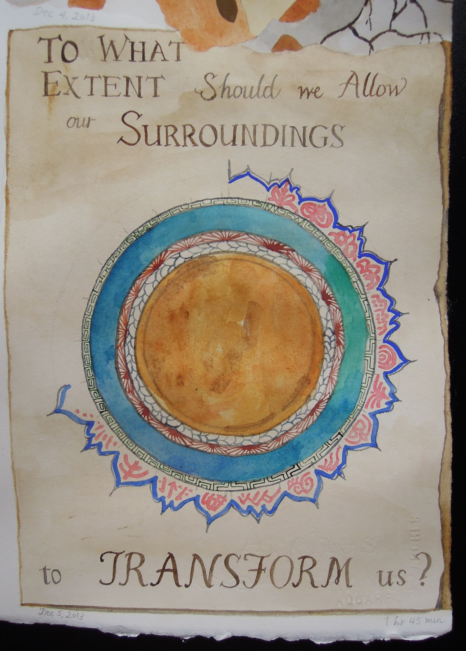
This is what the page looked like, after Fresco. By the way, these papers are 22″ x 30″ (56 x 76 cm).
As I said yesterday, “reading” logic would have me continue the next painting at the left side of the page, just under Epic, since that’s where the story started. I believe there are studies that show that people get used to text being a certain width — we’re accustomed to pausing every so many words in order to move our eyes to the next line — but I don’t think our visual comprehension works that way. Visually, I felt it would be too abrupt to shift back to the left side, especially since the lower edge of Fresco is already heading downward, below the baseline of the previous pictures. So I went with that instinct, and decided to put this next installment in the lower right-hand corner.
That decided, I was looking at the page and pondering what to do next, thematically, when a question came into my head: “To what extent should we allow our surroundings to transform us?” (Actually the wording went through a couple of revisions before I got to that, but I can’t remember the first “draft” now.) I had intended this page to be a story about our travels, but so far the text is mostly a series of questions. I suppose that’s appropriate, since much of the value of travel is prompting questions where previously we thought we had answers. At any rate, this question about transformation felt like it needed to be asked — clearly I’m finding myself unable yet to write our travel story. Apparently more explorations are yet required.
While casting about for some art-historical model for this painting, I thought first of sea monsters and fantasy beasts, and maybe drawing myself transforming into one. That seemed too literal, however — and I didn’t want to imply that I’d become a monster or that my travels had eaten up half of who I am! Eventually, while playing with Google image search, it occurred to me to look up “alchemy,” and that was much more interesting. As soon as I saw the pictures in the Wikipedia entry, I knew my painting would be based on those, and in particular, on a title page of a 17th-century German (?) text, and a page from a 14th-century Persian text.
I painted the page first, then did the calligraphy (which was SO MUCH FUN), then lightly traced my rolls of blue painter’s tape to make neat circles in the center of the painting. Then I started decorating the circles. It’s a curious thing: I started out envisioning something very European, with concentric circles and suns and moons and diagonal lines, but as I painted, my diagram started to move (aesthetically) east from there. It was partially the Persian text that influenced me, but later I also found myself looking up Chinese alchemy texts and Buddhist mandalas. Ultimately I think it looks like a blend of global and historical influences, and that feels right.
By the way, when I first painted some of those red designs around the outer edge, they looked horrible: much too bold and primary. There’s no good way to erase watercolor, but I tried by blotting the paint with a tissue. Then I was amazed how much the blotted, soft-edged red looked like the ink used on Chinese name seals. So I did the rest that way too, painting and blotting.
It was a deliberate choice not to “finish” that outer edge by going all the way around the circle. I stopped at first because my hand was getting tired, but then I looked at the open circle and decided I liked it. It felt more personal that way, less like a printed text and more like a system someone was still working out, and as such, it conveyed more of a sense of motion and transformation. All very apropos.
I have a vague idea for the next installment, but I’m not sure yet how it will work. Onward!


I love mandalas and this is a lovely, simple one.
Thank you, Sherry! I love them too, and circles and round shapes in general… which is probably why I keep drawing so many of them. 😉