I am finding this project works best when I go day by day, rather than trying to plan the whole sheet of paper in advance. It’s fine to start with a general concept, but when I get too specific with my ideas, I lose the flexibility and adaptability that make challenges fun — they become onerous tasks instead of exciting what-ifs.
I wasn’t sure where to go with this painting, art-wise or story-wise.
I started the sheet with Epic, which is essentially a title card (“We start our journey. April 2013”), and then followed it with The Procession, a wordless summary of our first seven months of travels. If this were a book, the reader would stop after page two and go, “Uh… that moved fast.” The logical next step might be a more detailed recap of the seven months depicted in Procession, but after spending three hours drawing Procession‘s tiny scenes of Toronto, Edinburgh, Reykjavík, Istanbul, and Paris, I couldn’t stomach the thought of repeating the process over the next week. Besides, I couldn’t see how that wouldn’t devolve into some version of “and Scotland was like this, and Iceland was like this, and Turkey…” Moreover, I have already described all those places at great length on my blog (and in words, sketches, and photos, at that), and I hate retreading old territory (I won’t even backtrack when we get lost!). So then what? It was an interesting problem: a writing problem, but I was tackling it by developing visuals rather than following a narrative arc. Or perhaps I should say by developing my visuals simultaneously with, or even slightly before, my narrative.
As I’ve often said, I have a hard time thinking in words and pictures at the same time. Usually when I’m on a painting streak, I do very little writing, and if I’ve been immersed in words, my paints go untouched. I don’t know if all writer/artists are like this, but I notice that I use my artwork and my writing differently. If I’m thinking about abstract emotional states, like fear of mortality, I’ll write. If I’m trying to evoke the feel of a place or a person, I’ll draw or paint. And usually, if I’ve drawn something, I don’t feel a need to embellish it with text, and vice versa. It’s only rarely that I will conceive of something that needs to be both text and image: the Tisha story, for example, or “Chickens,” or even my dream depictions. These words-and-pictures pieces are my favorite type of work, both to read/view and to do, but I can’t force them.* They have to just arise.
Which brings me back to this project. It did come to me as an idea for a combination text and image piece, but unlike my other such projects, I didn’t have much else to go on. The topic would be our travels, the paintings would be watercolors and probably inspired by historical masterworks, but that was it. No plan… just intuition, and that, too, can’t be forced.
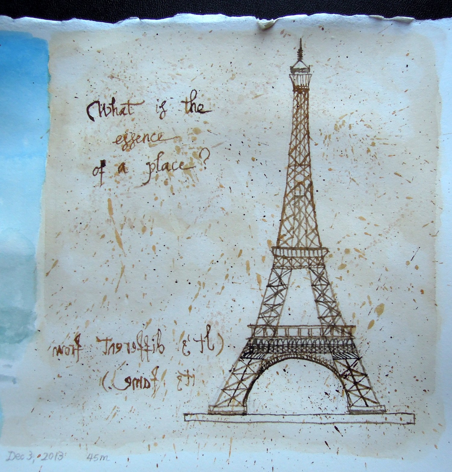
Since I didn’t want to describe all our travel stops in detail, I thought I should go in a more pensive direction, delving back into our journey as it affected my thoughts or my feelings, rather than how it played out itinerary-wise. I decided to begin with an echo of the previous painting, Procession. I hate to use the Eiffel Tower since it’s so cliché, but on the other hand, I wanted something that would be recognizable as a stand-in for a location. And to continue the art-history allusions, I was going to use one of those old architectural paintings — the kind that scream, “Behold, I have mastered perspective!” — but then I realized Leonardo Da Vinci’s sketchbook would be much more appropriate. I love Da Vinci for his polymathy, but his sketchbooks are also just wonderful aesthetically.
This is my homage:

I threw in a bit of mirror writing too, because I can and because Da Vinci wrote all his journal entries in reverse. After I’d done it I held up my painting to a mirror and broke out into a huge grin to see that it worked. I’ve flipped the image for you so you don’t have to do the same:

My picture is hardly Da Vinci (his drawings employed perspective, and were often his own inventions), but I had fun doing it — and spattering the background, and my laptop:

And I already have an idea for the next installment… though, of course, I may change my mind by then!

—–
*Actually, I particularly dislike a certain type of comics or illustrated writing… I can’t articulate what it is, but sometimes I see something and it just feels forced. There’s something very false and distasteful about dropping words into a beautiful picture, or choosing an illustration for a piece of writing that doesn’t need it. It’s like dreadful cheap mass-produced “art” that shows a photo of a pink rose with the word beauty under it in a cursive font (to use a particularly obvious example)… or a photo of a bride and groom accompanied by the word love. It’s so heavy-handed as to be worthless. In the rose example, it’d be much more interesting to just hang on your wall a piece of gorgeous calligraphy reading this is beauty. At least that would give you room to think, instead of telling you what to think. I’ve read very few comics or illustrated books where the words and images truly harmonize the way I think they should. Instead, most privilege one or the other (words or pictures). Come to think of it, this is not the first I’ve written (complained) about this.

perfect. 🙂
Tanky. 🙂 It was very fun to do!
i like your footnote; i hadn’t really thought of comics/illustrated writing like that before.
also, those paintings look so epic next to one another! can’t wait for more.
Thanks! 🙂 I’m enjoying interpreting my life and thoughts (and even my face) through the filter of old masters. 🙂
I’ve read a lot of comics, especially independent graphic novels (as opposed to, say, Marvel or DC), so certain things that I liked at the beginning have now come to seem very trite.
I love these projects very much.
Why thank you! 🙂 I’m having more fun with them than I imagined I would!
How thoughtful of you to flip the image for us 🙂 It looks like pen and ink! Well done Lisa!
Thanks, Munira! I hoped it would look like pen and ink, so I’m glad it does! If I’d been home I probably would have used my actual calligraphy pens and inks. 🙂
Well done, Lisa! Enjoying your project very much.
Thank you so much, Sherry! I’m enjoying it too — I constantly surprise myself with what I come up with, which has to be a good thing.