It’s been a long couple of weeks of soul-searching, so let’s take a break today and look at some drawings!
A couple of weeks ago I began reading the webcomic Questionable Content, after clicking through a couple of links from another favorite webcomic, Girls with Slingshots. (Please note! Not all of these comics are safe for work, or other environments.) Jeph Jacques has been drawing QC since 2003, and I spent days reading the entire archive of almost two thousand strips. (I did the same thing with GWS when I first discovered it, and also with Order of the Stick, though since both of those are shorter strips that haven’t been around as long, catching up wasn’t as huge a task.) QC is a great comic, and a real inspiration. When Jacques started, you could barely call it a comic, the drawings and layouts were so crude (and the font so unreadable). But he learned over time, and each year the art became noticeably better, until it’s now really nice-looking.

QC comparison: 2003 versus 2010 (Jacques redrew one of his earliest strips)
It gives me so much hope to see how Jacques’s drawings have improved. QC is practice in action!

One of my drawings from high school
One thing I can see that Jacques is working on, and still needs to work on, is making his characters look more individual and different from one another. It’s a difficult task, and I absolutely have trouble with it too. When I’m drawing cartoony people, I tend to do only subtle variations on my “standard face,” which is itself just a mild improvement on the way I drew people when I was a kid (see right!). I guess many of us doodlers probably start out drawing people the same way: a U shape for the head, two curves for eyebrows, and generic eyes and noses and mouths to fill in the rest. Hair is just lines attached in some vaguely hairlike fashion all over the head. Voilà: standard face! I still remember what a big deal it was when I started experimenting with different face angles, and accessories like glasses and hats! Although my life sketches have improved dramatically in recent years, that hasn’t translated into my cartoony drawings, and that’s a shame. (Well, it has translated a little bit. My proportions are better now, both on faces and on bodies. But that’s as far as it goes. Standard face still has all the same ol’ parts.)
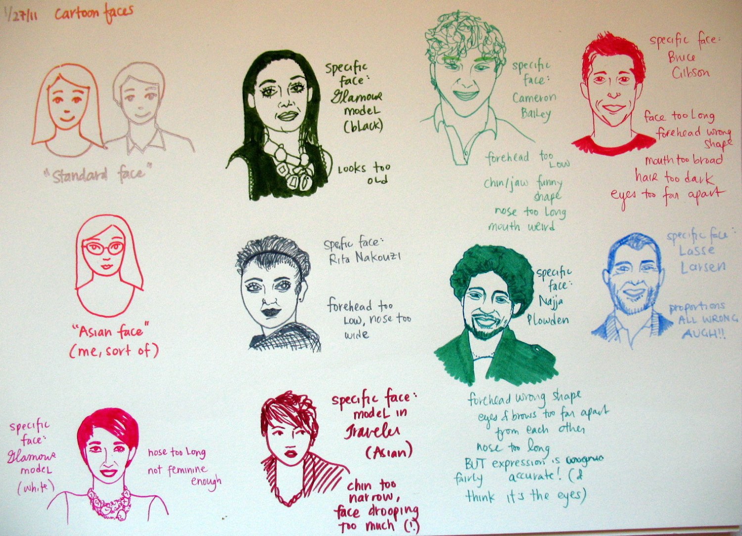
So today I went through my big collection of magazine clippings, and selected some faces and figures to practice with. First I drew my standard faces and figures for comparison, and then I attempted sketches of the individuals in the photos.

Practice with faces
The people didn’t come out looking like themselves, but they did come out looking like people — so much better than the bland standard faces! The same went for the figures, which I had much more trouble with (as evidenced by the craziness going on with the poor girl’s arm below). If I’d wanted to do this properly I could have done it in pencil, and I might do that in future, but for today I just wanted to see.

Figure practice
I think these still look not quite cartoony enough (I do like the uber-simple lines of my standard folks). So what I’d like to do, over time, is figure out how to translate the idiosyncracies of people’s faces and figures into more minimalist visual language. Of course, the simpler the lines get, the greater the loss in individualism (which is part of the power of comics), but I think I can achieve a better balance than what I’ve got now.

I love this post! If I could draw (or shall I say draw well) I know I would find this helpful and inspiring. I wish I was good enough to try the exercise you did, to see how I’d make out.
I wrote a children’s book that I was trying to learn to illustrate a couple of years ago, because my sister isn’t interested in doing it for me. She said if I practiced, I could probably figure out how to do it myself. When I stopped laughing, I found “Art School: How to Paint and Draw” on the sale table at Borders. I would probably feel better about trying to learn if I was just drawing for fun, the way I did when I was a kid.
Anyway, I like your pictures. Thanks for sharing your progress.
Thank you, Ré! I appreciate the encouragement, as always!
Have you given Art School a shot yet? I agree with you — it is so much easier and less stressful to learn new things when we let ourselves think we are doing it for fun. That’s how I had to talk myself into doing the sketches in this post, quite frankly. I knew I wanted to blog the finished drawings, so I was getting a little anxious about them, and finally just told myself, “Hey! This is for fun! IT IS FUN!” and then I was able to get to it!
Someday I hope I’ll remember how to think like a kid again, and when that day comes, I suspect I’ll be able to look inside my head and find a bunch of really cool children’s stories. Someday!
How fun, Lisa! And what a good idea to have a file of magazine cutouts to work from. I’ve cut lots of pictures out of mags over the years, but very few have any people in them. What do you suppose that means?…..I found a book at the library this week titled: Sketchbook Confidential – Secrets from the private sketches of over 40 master artists. If “practice makes perfect”, it is certainly reflected in this book. But too, you get a feeling of not only their commitment to their art, but that it is their joy and their pleasure — fun, if you will. We do need to return to that childlike playfulness that just delights in creative expression – with none of the judgement. Another kick in the pants to the inner critic, Re.
That reminds me…..Lisa, keep your eye on your mailbox. Snail mail is bringing you a surprise!
Ooh, my file of magazine clippings is so huge, I don’t know if I’ll ever get through it! I only started collecting them because of my decoupage work; while cutting out colors and textures for that, I’d occasionally notice other pictures I liked, and finally I just started saving those too. I should take a photo of my file sometime and post it on this blog. 🙂 It might be fun for you to see!
What kinds of things are in your saved magazine pages?
Sketchbook Confidential sounds amazing. I love looking through others’ sketchbooks; it’s a real learning experience and also satisfying for my inner voyeur. 😉 I’ll look for that book!
I’m eager to find out what your surprise is! Thank you!!
About 5+ years ago I did a picture journal exercise from the book What Color is Your Slipcover? Like you, I had stacks of magazines, and it was the most fun just cutting out everything that caught my eye and pasting it in my big sketch book (14″X17″). Lots of nature pictures, home interiors, food, place settings, cozy fireplaces, cushions and candles and book shelves full of books. I still like to go thru this journal ocassionally and I still love just about everything I cut and pasted in the book. This exercise was designed to get one in touch with their design asthetic. Truth be told, my home really doesn’t reflect the journal except in a general way. In other words, my home would never be featured in a magazine!
…..except perhaps Mother Earth News.
😉
I keep home photos in my clippings file too, full of images of rooms and homes that somehow speak to me. If I ever write another post about “home” on this blog, I’ll try to remember to include some of those pictures!
Ré and Sherry, I’m going to respond to your comments in more detail later (got some yoga to do now!), but I just have to share something I heard from a drawing teacher about Picasso. He said he spent his entire life trying to return to the way he drew when he was five! And there you have it, right out of the mouth of one of the great artists!
Cool! There’s hope for me after all!
I have found two relevant quotes from Picasso:
“When I was a child I drew like Raphael. It took me my whole life to draw like a child.”
“Every child is an artist. The problem is how to remain an artist once we grow up.”
I would also substitute “dancer” for “artist” in the second quote. 🙂
Love these quotes!…..but I am ashamed to say that I have never really liked Picasso’s work. I know, I know, very sad indeed. Maybe instead of a 5 year old I will endeavor to channel my 8 year old self:)
🙂 I do love Picasso, but I’ve never much liked Monet… or Chopin. To each our own taste! 🙂
I do like Monet — but our younger son doesn’t. His comment after viewing a Monet exhibit in Baltimore some years ago: “Monet is all technique and no content.” Had to laugh. Like you say, to each his own:)
The “standard face” concept totally cracks me up, and yes, that’s pretty much all I can muster when I draw cartoonish people. I loved seeing your drawing comparisons! The figure in the business suit really struck me, because it’s always been difficult for me to capture motion, but you really nailed it with the positioning of the legs!
Can I just say again that your blog always inspires me to be more creative. Thanks so much for sharing so much juicy, artistic material! 😀
Hee, glad you liked it. 🙂 Standard face is something I’ve always done, but I actually never noticed it until I’d been with Erik for a while, and he pointed it out. It’s not just faces I do it with; I have standard everything, pretty much. 🙂 It does give me quite an advantage at Pictionary, I must say. ;b
You’ll get a kick (or a groan) out of this: the guy in the business suit is actually tennis star Roger Federer, and the photo was from an ad for private jets. I didn’t even know private jet companies needed to advertise in magazines… (Condé Nast Traveler, if you’re curious) but apparently they’re in Google AdWords too! Erik got one once (he has no idea how) that promised he could get a private jet “for as low as $4,000 an hour.” I hope someone will shame me to death if I ever get rich enough to spend $4K an hour, and spend it in that fashion!!!
Thank you hugely for the kind words on the blog!!! I’m so grateful it’s sending creative waves out there into the world. 😀